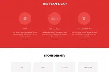
People visit websites on phones, tablets, laptops, desktop monitors and even TVs. Responsive web design makes one website adapt gracefully to all of them — rearranging layouts, resizing images and adjusting navigation so the experience feels natural on every screen.
How responsive design works
Responsive websites use three core techniques:
- Fluid grids: layouts based on proportions rather than fixed pixel widths, so columns stretch and shrink.
- Flexible images: images scale within their containers and load appropriately sized files.
- Media and container queries: CSS rules that change layouts at certain widths — for example, three columns on desktop becoming one column on mobile.
Why it matters
For visitors
A responsive site is easy to read and use without pinching, zooming or horizontal scrolling. Visitors stay longer and complete actions more often.
For search visibility
Search engines primarily use the mobile version of content for indexing and ranking. A poor mobile experience can hold back visibility. See our guide to SEO for small businesses.
For maintenance
One responsive site is easier to manage than separate desktop and mobile versions.
What changes across screen sizes
| Element | Desktop | Mobile |
|---|---|---|
| Navigation | Full menu | Collapsible menu |
| Layout | Multiple columns | Single column |
| Images | Large, wide | Cropped for portrait screens |
| Typography | Larger headlines | Adjusted sizes for readability |
| Buttons | Mouse-friendly | Large tap targets |
| Tables | Full width | Scrollable or restructured |
Mobile-first approach
Many designers now design the mobile experience first, then expand for larger screens. This forces prioritization: what matters most when space is limited? The result is usually a clearer site on every device.
Responsive images
Serving huge images to phones wastes data and slows pages. Responsive images let browsers choose appropriately sized files for each screen. Combined with modern formats and lazy loading, they significantly improve speed.
Common responsive design problems
- Text too small to read on phones
- Buttons too close together to tap accurately
- Pop-ups covering content on small screens
- Horizontal scrolling caused by wide elements
- Images cropped awkwardly
- Menus that are hard to open or close
How to check your website
- Open your site on your own phone and try key tasks: find a service, call you, submit a form.
- Test on a tablet in portrait and landscape.
- Resize your desktop browser and watch how the layout changes.
- Use browser developer tools to emulate devices.
- Ask a few customers to try the site on their devices.
Responsive design and branding
Your brand must stay consistent across screen sizes. Logos may need compact versions for small headers — see our article on what makes a good logo for why scalable marks matter.
A worked example
A regional law firm’s website looked polished on desktop, but on phones the navigation menu overlapped the logo, practice area cards were squeezed into tiny columns and the contact form extended off the screen. A responsive rebuild used a flexible grid that stacked cards into a single column on small screens, a compact mobile menu, fluid typography that scaled smoothly and responsive images that delivered smaller files to phones. The same content now adapted gracefully from a small phone to a large monitor, and inquiries from mobile visitors increased because the contact form was finally easy to complete.
Breakpoints vs. fluid design
Older responsive sites jumped between a few fixed layouts at specific screen widths. Modern responsive design combines breakpoints with fluid techniques — flexible grids, scalable type and components that adapt to the space they’re placed in. The result is a layout that looks considered at every width, not just at a handful of common device sizes.
Questions to ask your designer
- How will the navigation work on small screens?
- Which content appears first on mobile?
- Are images served at appropriate sizes for each device?
- How are tables, forms and long content handled on phones?
- Which real devices will you test on?
Key takeaways
- Responsive design lets one website work beautifully on every screen.
- Flexible grids, fluid typography and responsive images are the foundations.
- Plan content priority for small screens first.
- Test on real phones and tablets, not just by resizing a browser.
Responsive by default
Every website we design is responsive and tested across phones, tablets and desktops. Explore our website design services, see examples in our web portfolio, and read our complete website design guide.
Frequently asked questions
What is the difference between responsive and mobile-friendly?
A responsive site adapts its layout fluidly to any screen size. "Mobile-friendly" is broader — a site may work on phones without being fully responsive across tablets and large screens.
Does responsive design affect SEO?
Search engines primarily evaluate the mobile version of pages, so a good mobile experience supports visibility.
How do I test if my website is responsive?
Resize your browser window, use your browser’s device emulation tools, and most importantly test on real phones and tablets.
World Website Designs
Need help with web design?
Award-winning designers, unlimited revisions and 100% ownership rights — with 24/7 support.