Lock this price and use it later when you want.
Even in the era of the barter system, when goods where exchanged for other goods (instead of money) accounting played an integral role in achieving a market tally for a country, state, city or any firm. Generally Accepted Accounting Principles (GAAP) date back to the Mesopotamian civilization and in the 14th century, the Italian Luca Pacioli regarded as the father of Accounting and bookkeeping introduced the “double entry”. In 1880 accounting bodies began merging to form the Institute of Chartered Accountants in England and Wales. (ICAEW)
As per the ICAEW accounting logo design, the institute lady depicted in the image was derived from a book ‘Iconologia’ (1603) illustrating economics as per the time. The rod signifies command, the rudder insight and the dividers in the right hand estimates expenditure. The swift communication of responsibilities of an accountancy firm via its logo forms the essence trust between an organization and its clients.

A professional accounting logo design is critical to anchor the face of the new firm. Its representation is the forecast of profit and loss of a new organization. The primary concern of any start-up company is the ‘budget’. No matter how many CET (cost effective techniques) utilized there is still room for improvement in order to save, however do not let this effect the budget of a new design. Deductions in the logo budget could have adverse effects as ineffective communication through a logo would lack the “WOW’ factor and aid in weak marketing. Instead hire a professional, so that a unique, communicative, catchy logo is developed creating a prodigious Launchpad.

AVarious contributing factors either make or break the current status of an existing firm, out of a colourful list, the factor with the highest impact is ‘presentation’ hands down. In terms of competition and return on investments, statistically most organizations with a unique, conspicuous logo with immediate communication of income and expenditure in the book keeping or finance fields have a stronger margin of profit. An accounting logo design denoting the right fonts related to insurance, taxation and policies with a graphic symbol utilized consistently without recreating logos on letter heads, business cards and presentations would have a better impact on consumers who grow to know. Furthermore, competitive markets demand zero errors from any accountancy firm to be able to depend and trust completely. It is imperative that a logo in the book keeping market be not only communicative and coherent, but also competent. A logo has the power to lead the competition simply by imparting 80% of the goals and motto of the company.

Making full changes to a logo design especially for a financial firm shows instability. Alterations to a certain extent are acceptable, but a complete transgression may affect the loyalty and trust of the consumers. To cope with this, most firms are effective in communicating a change prior to its unveiling. The importance of hiring a professional to develop a logo at start up is hence necessary. From business cards, letter heads, stamps to that of marketing, every business unit may suffer repercussions or benefits.
Inclusive of ‘taking care of the competition’, ‘conveying your immediate business message’ and ‘cost effective techniques to develop’, a firm must prioritize on what kind of impact is it looking to make on its clients and consumers.
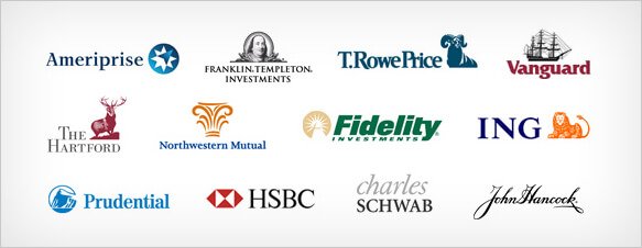
The passport to your firm especially in the accounting and finance field is your competitive, memorable and unique logo. The above images speak volumes of trust, loyalty, outstanding service and most significant “comfort” for the clients. The more you invest in the identity of your firm the better the logo with greater impact. For example Franklin Templeton Investments, Rupert H Johnson SR somewhere in the 1940’s chose to have Benjamin Franklin as the companies’ direct image and name, keeping in mind that the U.S founding father epitomised the ideas of frugality and consistency when it came to saving and investments.
Get a Custom Accounting LogoDiscuss with Our Experts & Choose
the Best Package for Your Busines
Call Toll Free
+1 (323) 503-2379Need Help?
Live ChatNeed Help?
Email UsSee what our customers have to say about our remarkable logo design services

They are incredibly flexible and courteous. Their quick delivery times, amazing service and economical rates has made us a permanent client. Kudos to WWD .

WWD transformed my vision into reality. I am glad to say that I am absolutely thrilled with the results. These guys definitely exceeded my expectations and I am sure we…

Their team depicts sheer professionalism. I am a fan.

We are really happy with our website, we had it redone to be responsive and we are already witnessing the increase in number. This is amazing

I am satisfied with the organized and clean layout of my webpage. All my queries were dealt with perfectly and communication was excellent.

I had an absolute blast working with World Website Designs. Everyone from my account manager to the designer was fantastic and very thorough.
We've been Honored & Recognized for our Outstanding Achievements in the Industry