Lock this price and use it later when you want.

Fitness has been a primary concern world over. Either people have time and no money or, they in-definitively have money, and no time. To be able to attract the masses towards health has been a Hercules task since decades. Famous bodybuilders and athletes have managed to strike that chord of inspiration to take time out and prioritise one’s life with an hour of work out a day. Arnold Schwarzenegger and Jane Fonda at a time were the inspirational images of masses and still are! Their stories are not only inspiring but light that spark to be able to hit the gym. The task is either to go and work out or buy the equipment for home exercises. No matter the situation, every customer that enters your store or is on your web site is motivated in some way or the other. How do you keep the consistency levels higher than before? How do you attract the masses to you fitness centre or your online website? Is it still about the money? – It’s about the Image that serves people as a reminder of what they can be if they spare an hour out of their day! The image hence in a physical fitness logo design is most significant.

Shapes and symbols combined form an appealing Physical Fitness Logo Design. The appeal however is to the masses, the minute a logo portrays a feeble image – it would almost immediately be a turn off in the minds of the viewers to choose another. To have an energetic logo with attractive colours, mesmerizing the senses and luring the audience in general has track records for all ages to be present in the gym. The logo and image above by World Website Designs depicts a circle with a nucleus just like an atom. Spheres around it denotes “evolution”. The logo is not only trendy but also attractive with virtuous colours. Using shapes and symbols together in your Physical Fitness Logo Design could also be risky- Too much of anything may cause blur. An image that which is decipherable and has a catchy phrase delivers all the time.

Most fitness centres have communities – hence have their own apparel as well. The logo design would not only be imprinted on sweat shirts, wrist bands, Weight Belts and dumbbells but also on the community fitness centre website. The logo design becomes and automatic face of recognition and in turn motivation.
The above image has energy personified! The blend of blue grey and white colours depict growth, steady pace and evolution. The logo would also justify on sweatshirts, wristbands and gym equipment. Most personal trainers and physical fitness centres look forward to an energetic, alarming and unique logo. To justify the same, a designer must be able to think out of the box in order not to copy but to create a memorable and easily decipherable design.
Merchandise and products to build a better physique or to lose weight are mostly sold online or catered to at stores. Your logo will be the direct portrayal of your products and their standardization. Choose wisely when it comes to a designer in this particular industry as the trends ‘never’ remain the same. Choosing a logo that which may be energetic enough but losing to competition in time may result in spending more money. Surprise yourself indeed with the image developed, however if you feel it lacks the sting factor or the zeal, have it revamped immediately.
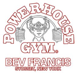
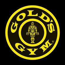
Out of the many here is a listing of the world’s top 5 fitness centres and their appealing logos across the globe where the likes of Kai Green, Phil Heath, Ronnie Coleman and Jay Cutler show up for a work out!
The above logos from the world’s top ten goes to show that typography and colour have not been completely ignored. Each symbol has its own unique way of motivating the viewer’s perception.
Discuss with Our Experts & Choose
the Best Package for Your Busines
Call Toll Free
+1 (323) 503-2379Need Help?
Live ChatNeed Help?
Email UsSee what our customers have to say about our remarkable logo design services

They are incredibly flexible and courteous. Their quick delivery times, amazing service and economical rates has made us a permanent client. Kudos to World Website Designs .

World Website Designs transformed my vision into reality. I am glad to say that I am absolutely thrilled with the results. These guys definitely exceeded my expectations and I am sure we…

Their team depicts sheer professionalism. I am a fan.

We are really happy with our website, we had it redone to be responsive and we are already witnessing the increase in number. This is amazing

I am satisfied with the organized and clean layout of my webpage. All my queries were dealt with perfectly and communication was excellent.

I had an absolute blast working with World Website Designs. Everyone from my account manager to the designer was fantastic and very thorough.
We've been Honored & Recognized for our Outstanding Achievements in the Industry